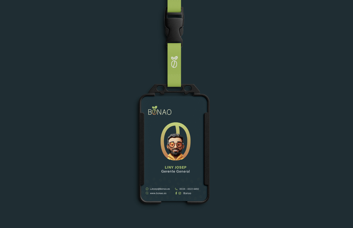
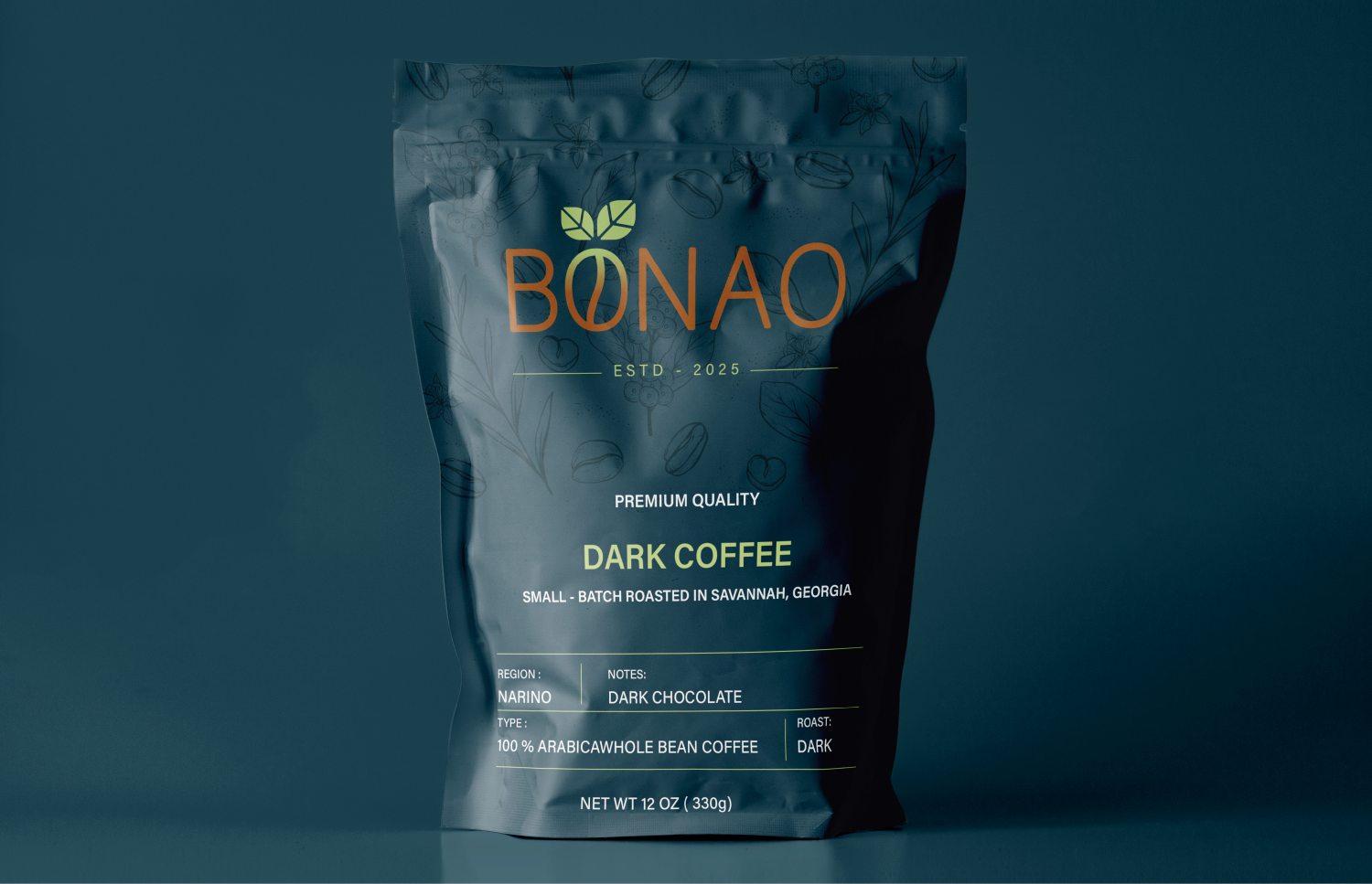
BONAO Coffee Beans Logo Design Process
Research & Identity Understanding
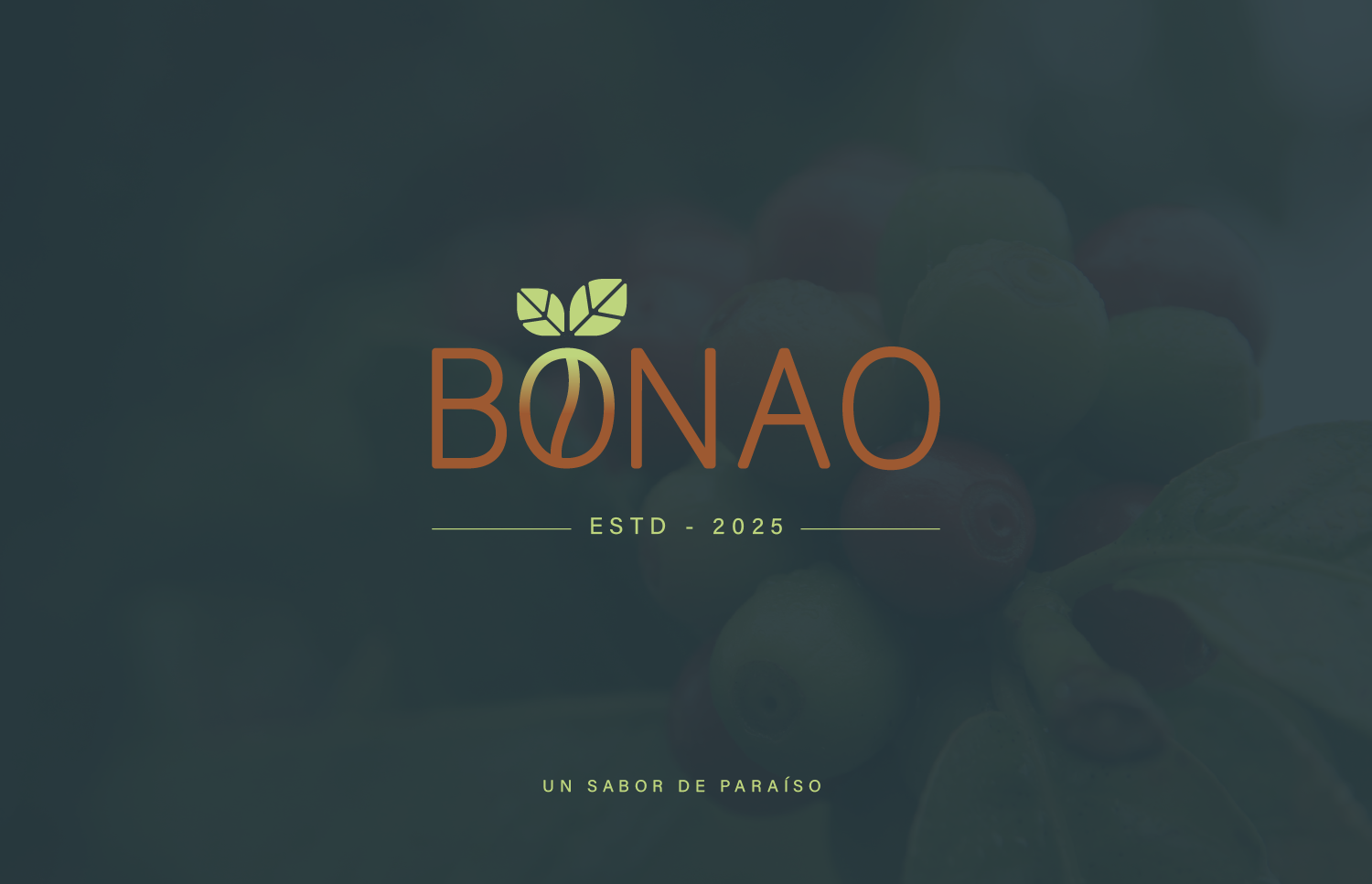
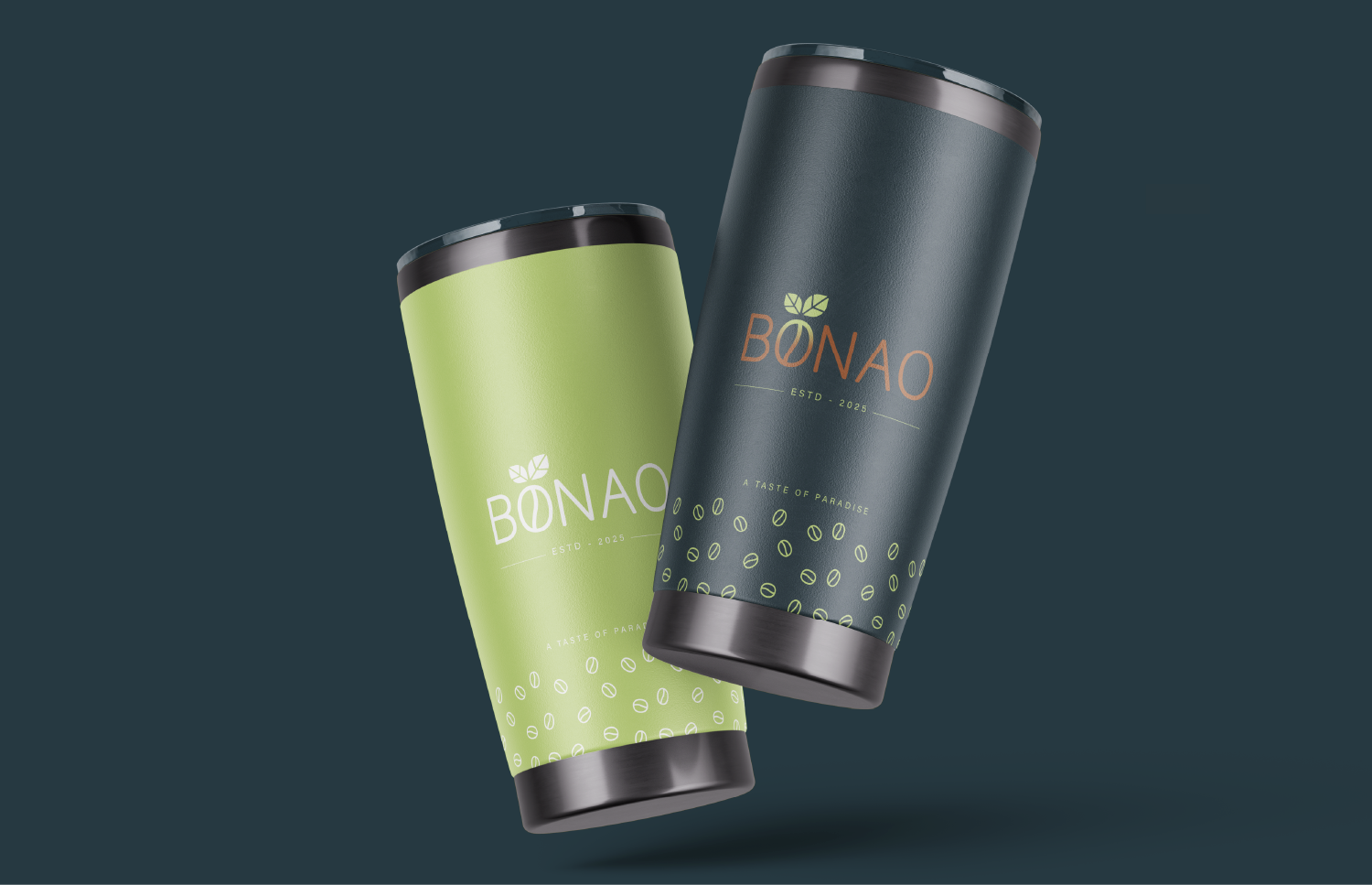
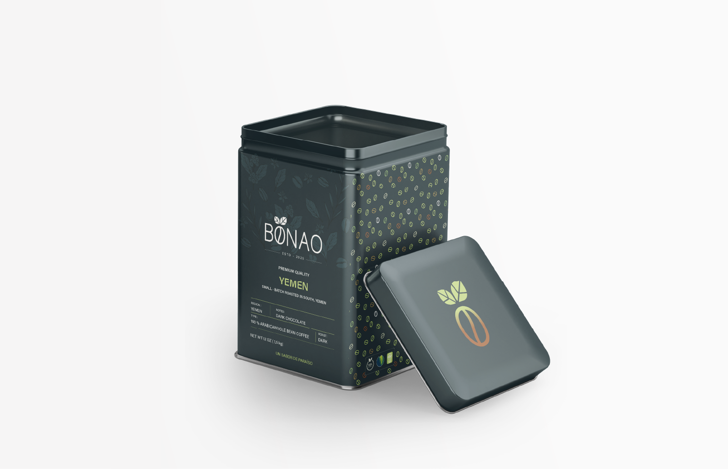
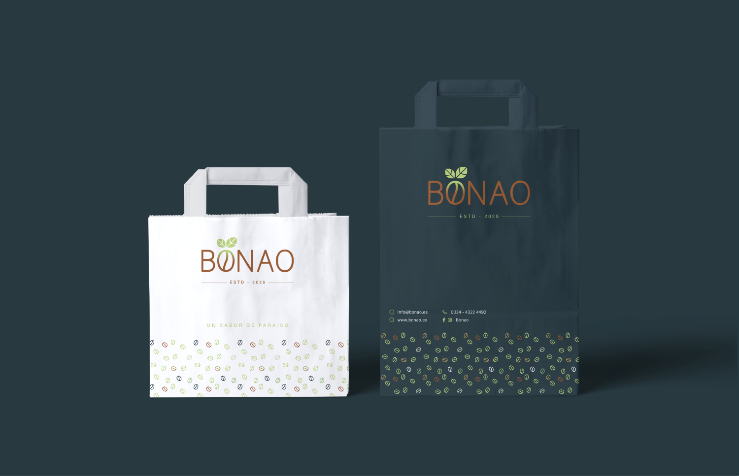
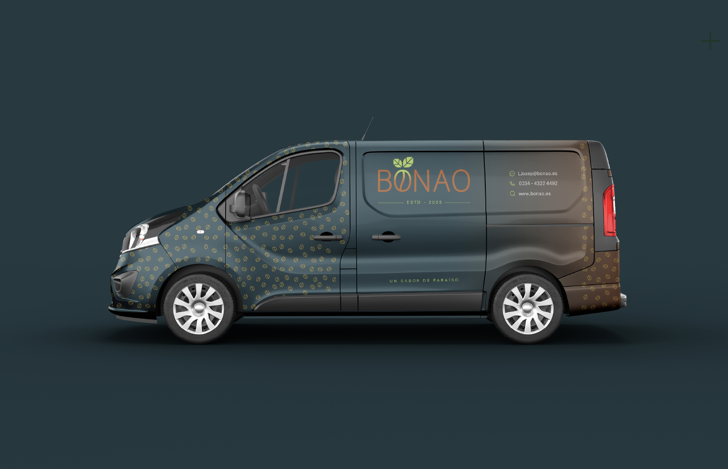
The design journey began with a deep understanding of the BONAO brand—a premium coffee product rooted in a tropical, natural environment, with a strong sense of authenticity. The brand values were clear: nature, flavor, purity, and quality.
Developing the Visual Concept
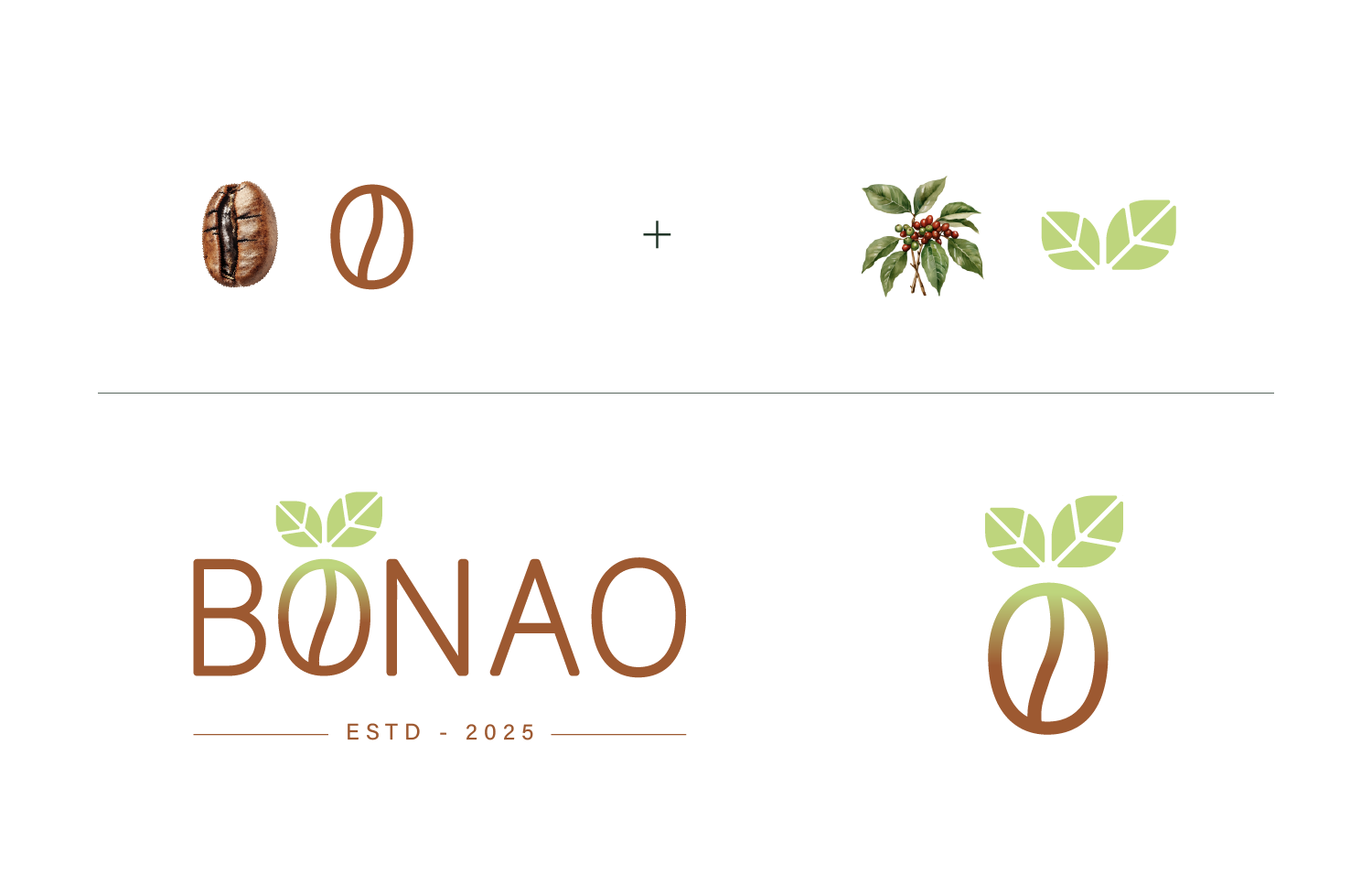
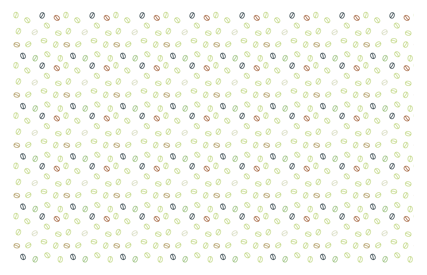
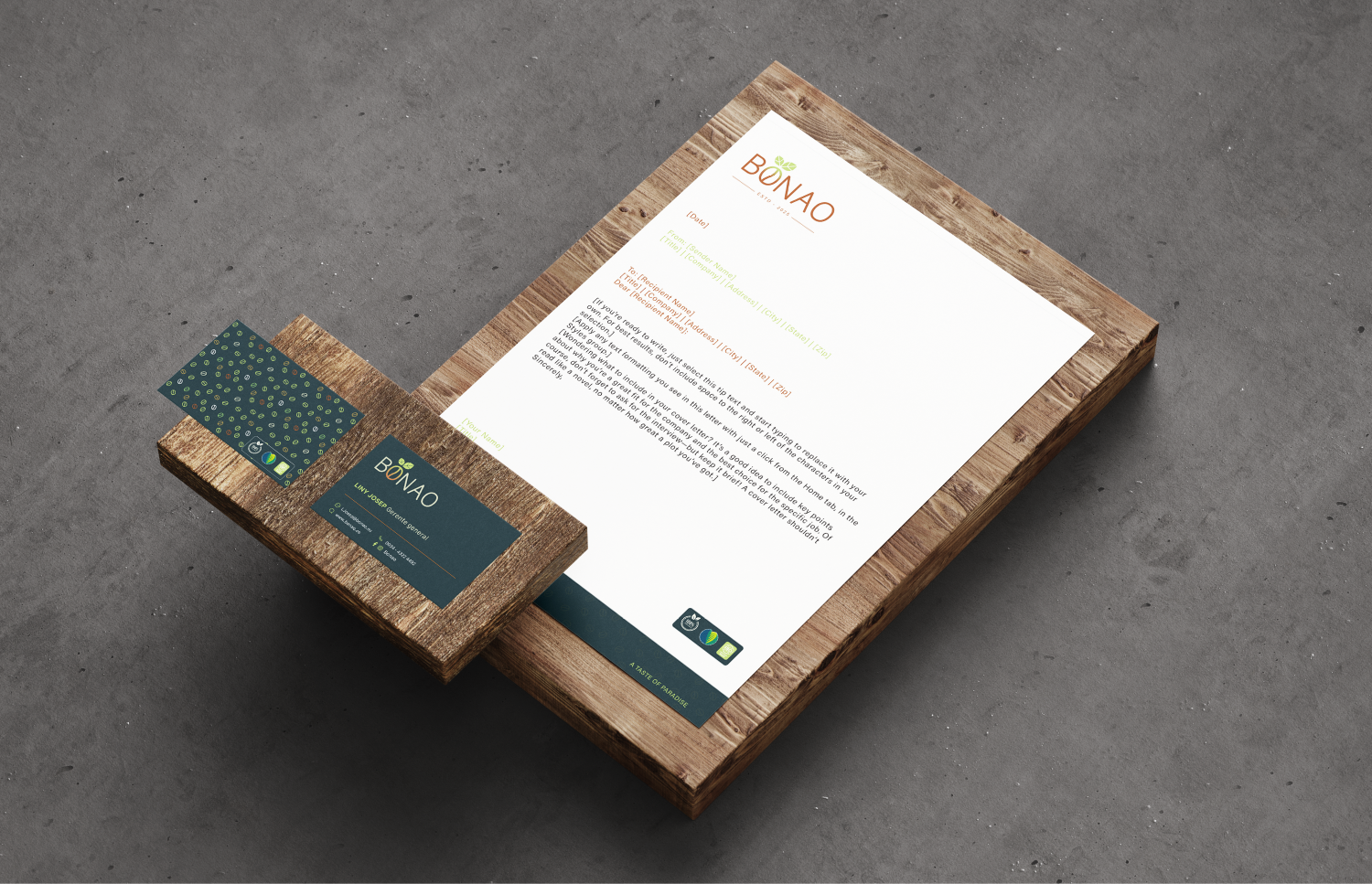
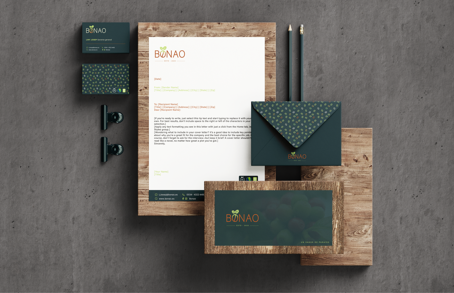
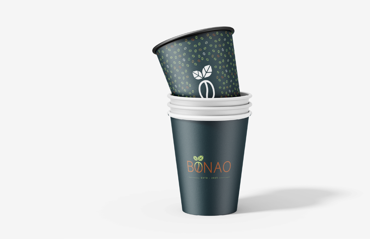
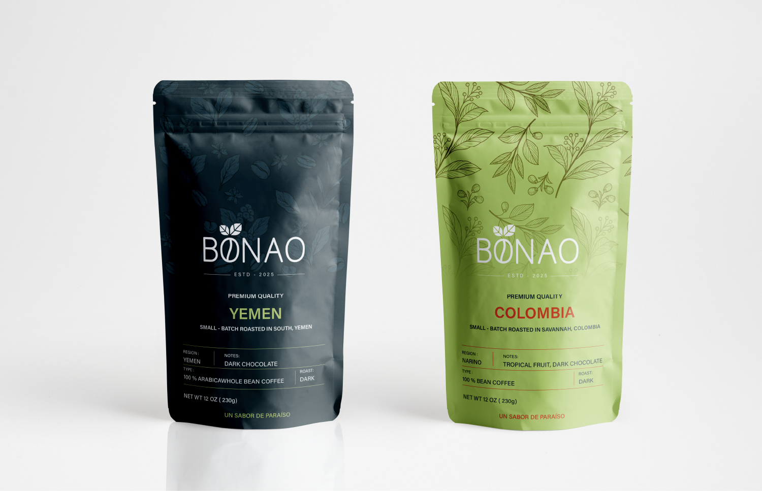
The creative idea centered around integrating a coffee bean directly into the wordmark. The letter “O” was transformed into an oval shape resembling a coffee bean, complete with a central line representing the natural split of the seed.
Symbolizing Growth and Life
Two leaves were added above the “O”-bean, reinforcing the agricultural essence and green identity. These elements symbolize growth, freshness, and harvest.
Typography & Color Palette
Font: A clean, modern typeface was chosen to balance professionalism with a warm, approachable look.
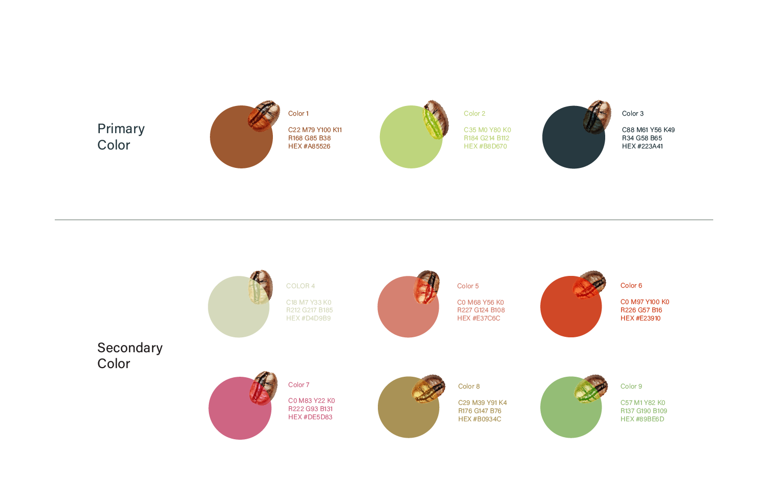
Colors:
A reddish-brown/dark orange tone for the text reflects roasted coffee and rich flavor.
A light green for the leaves expresses freshness and organic quality.
The dark background adds depth and elegance, making the logo stand out.
Supporting Elements
The phrase “ESTD – 2025” grounds the brand in time, conveying credibility and establishment.
The tagline “Un sabor de paraíso” (“A taste of paradise”) adds a poetic and emotional touch, capturing the luxurious, tropical essence of the coffee experience.
Final Outcome
The BONAO coffee logo is more than a design—it’s a visual story of authentic flavor and natural elegance, reflecting the premium quality of the beans and the warmth of their origin.


